
GROUP PROJECT
LINKEDIN: CONNECTION MANAGEMENT FEATURE
“How do we design a better platform experience by helping users find and remember their connections in intuitive ways?”
55% of LinkedIn users have over 500 connections, and yet lack a built-in way of organizing connections or adding notes to better leverage those connections later on. As a user’s network grows, it can become especially difficult to find older connections. Additionally, users only spend an average of 17 minutes per month on the platform, a shockingly low figure compared to other social networks.
How do we create a feature that lets users organize and contextualize their connections to make them easier to find and use later on? How can this drive platform engagement?
PROJECT INFO
2 WEEKS (OCT - NOV 2019)
3-PERSON GROUP
ADDING FEATURE TO EXISTING APP
SKILLS
PROJECT PLANNING / DELEGATION
BUSINESS + USER RESEARCH
DIGITAL PROTOTYPING (HI-FI)
USABILITY TESTING
TOOLS
TRELLO
SLACK
GOOGLE DOCS / SUITE
OTTER.AI
WHIMSICAL
SKETCH / SKETCH CLOUD
INVISION
MEET THE TEAM
ME

USER INTERVIEWS + CONSENT FORM
SKETCH SYNTHESIS
APP SCREEN INVENTORY
HI-FI DIGITAL PROTOTYPE
USABILITY TESTS

USER INTERVIEWS + SCREENER
PROTO-PERSONAE
STYLE GUIDE
HI-FI DIGITAL PROTOTYPE
PRESENTATION SLIDES

RESEARCH PROTOCOL + SYNTHESIS
BUSINESS + COMPETITIVE ANALYSIS
USER FLOWS + APP MAP
USABILITY TESTS
PRESENTATION SLIDES
We each wanted to draw on our respective strengths while being able to sample all parts of the process: Camila and I tackled the design process, while Morgan drew on her anthropology background to lead the research process. All three of us participated in the initial sketching, affinity mapping, project planning, and strategy decisions.
We also wanted to make sure that we were able to resolve differences of opinion. Most important was communication, so we checked in daily for at least 15 minutes, though we often spent considerably longer together when it came to hashing out design decisions.
RESEARCH / UNDERSTANDING THE COMPETITION
Many social platforms and contact management systems include organizational capabilities, so we conducted competitive analysis to determine the ways in which these were implemented and how we might incorporate them effectively. We found that flexible tagging schemes were widely-implemented features that would be familiar to users and well-suited to our challenge.
RESEARCH / UNDERSTANDING THE USER
USER INTERVIEWS
We conducted thorough research in order to understand LinkedIn users. We first created a screener to gain insight into potential interviewees’ platform familiarity and usage habits, then interviewed five users, all of whom:
Had over 500 connections (we wanted to know how they managed large networks)
Used LinkedIn at least several times per week (we wanted some degree of platform familiarity)
Added several connections in the past month (we wanted insights into how users navigated the connection process)
Had used the platform for at least several years (we wanted to know how people remembered older connections)
AFFINITY MAPPING + SYNTHESIS
We then created an affinity map, which brought to light a variety of user behaviors, desires, and pain points.

USERS REMEMBERED CONNECTIONS IN MANY WAYS:
Name
Employment / education history
Date of connection
Mutual contacts
Closest association / where connection originated
Face / avatar
USERS WANTED ORGANIZATIONAL FLEXIBILITY:
Users wanted to organize by when and how they met contacts, as well as other memorable characteristics
Users wanted to add personal contextual notes to contacts (some wanted to be prompted at the time of connection)
Even those users who self-identified as “lazy” recognized the value of well-organized connections
USERS WANTED A MORE RELEVANT PLATFORM EXPERIENCE:
Users didn’t like “noise” from random posts and notifications, and only wanted updates about their close connections
Some users had become more selective about adding connections
Users felt the app and website were cluttered and unintuitive
“If there was some kind of genuine way for the platform to rekindle relationships… because who cares if you’re connected to 1,100 people if they barely even remember who you are”
“I definitely add a lot of random-ass people and sometimes I’ll just be scrolling through my feed and be like ‘where the hell did I meet this lady?’ like I don’t remember her at all”
SYNTHESIS / CRYSTALLIZING THE USER PROBLEM
“LinkedIn users with large and growing networks need a way to organize their connections in order to better remember and leverage them.”
“We believe that by providing LinkedIn users with ways to view, add, search and organize their connections by customizable contextual information and shared attributes, we will make it easier for these users to both understand the context behind their connections and to look up specific contacts using a variety of naturally memorable attributes.”
“We will know this to be true when LinkedIn users with many connections report fewer issues finding, remembering, and associating contacts.”
SYNTHESIS / CRYSTALLIZING THE BUSINESS PROBLEM
“By providing these additional contact management features to professionals actively using LinkedIn, we believe they will value the platform more and engage each other more consistently through the platform.”
“We will know this to be true when LinkedIn users with many connections spend more time per month managing their network and communicating with other members via the platform’s “InMail” direct messaging and other content sharing tools.”
SYNTHESIS / PROTO-PERSONAE
We created two proto-personae to further synthesize our design challenges and to keep our target users in mind as we navigated subsequent parts of the project.

PERSONA 1: OPPORTUNITY SEEKER
NEEDS
Remember who I am connected with on Linkedin
Organize contacts to help with my job search
GOALS
Find a job
Get referrals from Linkedin connections
PAIN POINTS
I forget how I met someone who’s part of my Linkedin network
People invite me to connect on LinkedIn, but I don’t know why they want to connect with me
BEHAVIOR
Go to networking events
Message hiring managers
Message connections for referrals, informational interviews, etc.
Search, save, and apply for jobs
Moderately comfortable with LinkedIn’s website and app

PERSONA 2: NETWORK SUSTAINER
NEEDS
Organize contacts to help me remember who they are
Look up people from my Linkedin connections based on the context of how we met
GOALS
Remember contacts I haven’t communicated or worked with in a long time
Reconnect with people effectively
PAIN POINTS
I can’t find a person that I’ve worked with because I can’t remember their name, but I know that they are part of my Linkedin network
People invite me to connect on LinkedIn, but I don’t know why they want to connect with me
BEHAVIOR
Have many connections on Linkedin
Browse content on newsfeed
Use Linkedin messaging to reconnect to former coworkers and schoolmates
Moderately comfortable with LinkedIn’s website and app
DESIGN / DESIGN STUDIO
We began with a design studio, rapidly sketching ideas and iterating on them. Notably, I thought to use existing profile information like experience and education to create automatic groups and enable a form of “smart” browsing. Though this feature evolved through various iterations, it provided valuable “out-of-the-box” functionality to our final prototype.

The beginnings of the smart tagging feature

DESIGN / SKETCHING
We then created our own sketches based on everything we’d discovered up to that point. Afterward, we reconvened and discussed what we liked best about each of our ideas before creating a master paper prototype for usability testing.
DIVERGING: SKETCHING OUR IDEAS

Various forms of context

Adding tags to a connection

A refinement of the smart tags feature
CONVERGING: SYNTHESIS FOR PAPER PROTOTYPE

Adding tags to new connection
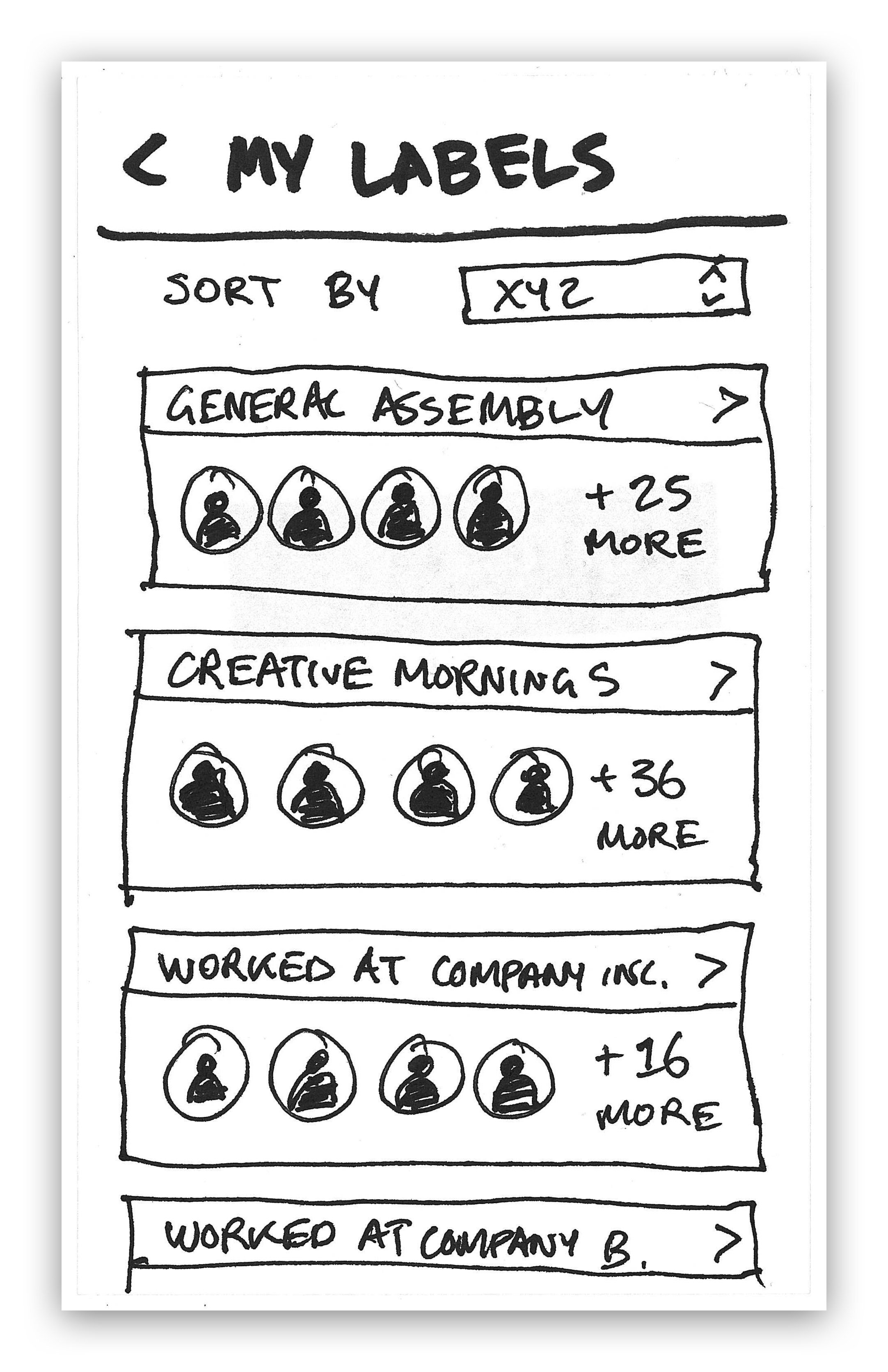
Browsing tags

Context summary (Camila’s sketch)

Tags in search results (Camila’s sketch)
DECISION POINT: SHARED TAGS
Should tags be public? We debated at length whether to add this functionality.
PROS
If the user initiating the connection were able to pre-fill the custom tag and share it with the recipient, it would halve the total amount of work required to categorize the connection, while encouraging organization on both ends.
CONS
We realized there would be significant technological hurdles to successful implementation: What would happen when the initiator used a slightly different tag spelling than an existing tag the recipient already had? This would likely lead to organizational chaos on both ends. Additionally, what would happen when one party wanted to modify the tag?
In the end, we decided that in the interests of time and complexity, tags should be kept private.
ITERATIONS / USABILITY TESTING
We conducted three usability tests with the paper prototype, asking users to complete four separate tasks:
Adding a new connection and entering contextual information
Batch adding connections to a new group
Finding a connection without remembering their name
Looking up contextual information about a connection


DESIGN / HI-FI DIGITAL PROTOTYPE
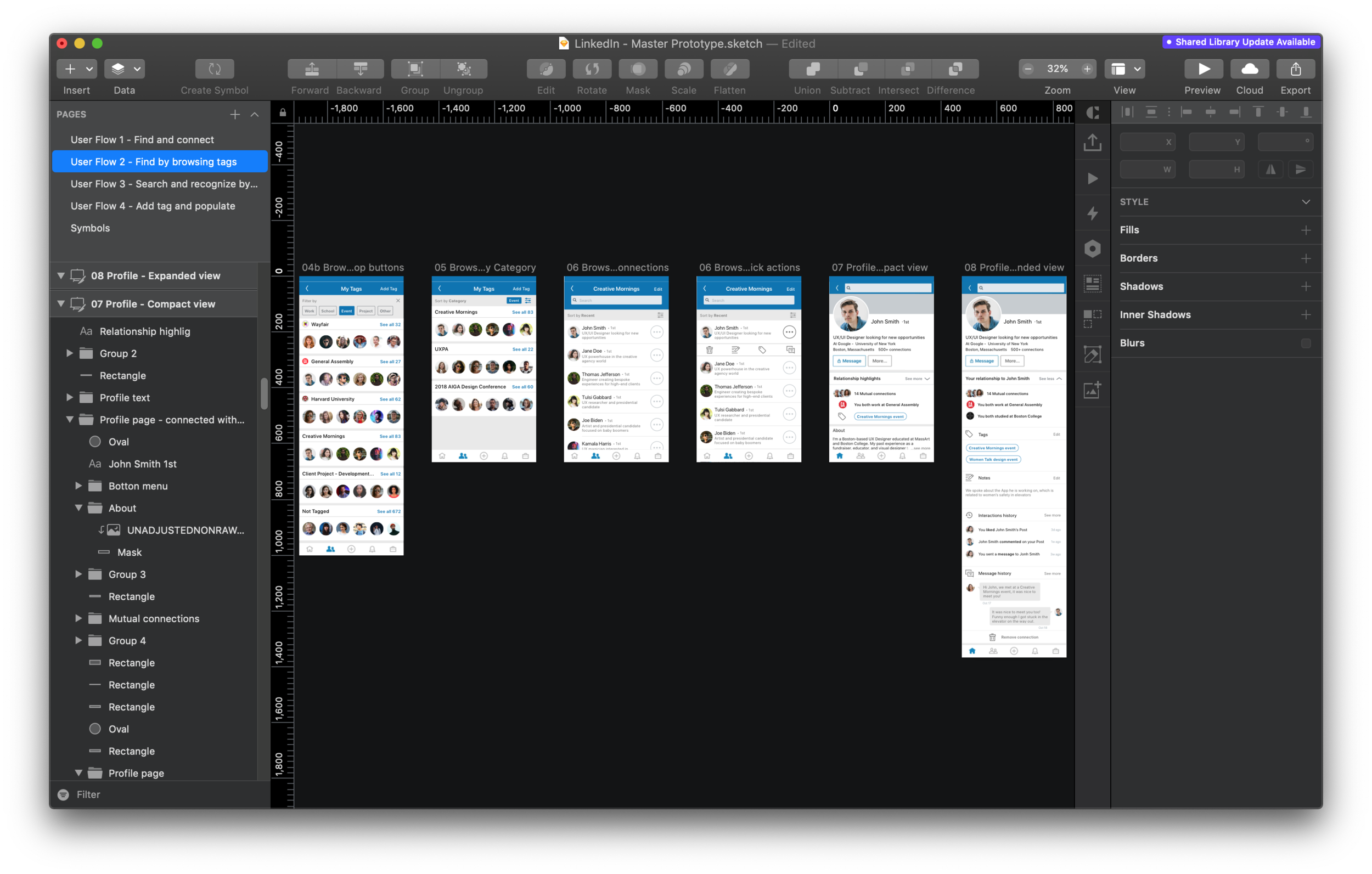
We took all our usability testing results into account and created a high-fidelity prototype in Sketch.
To better organize our workflow, Camila created a style guide for the existing brand and design aesthetic, while I created a version of the user flows to identify the number of distinct app screens we would need to build or modify.

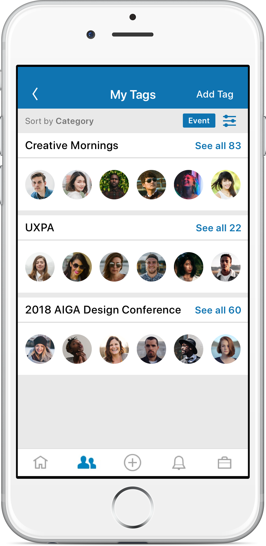
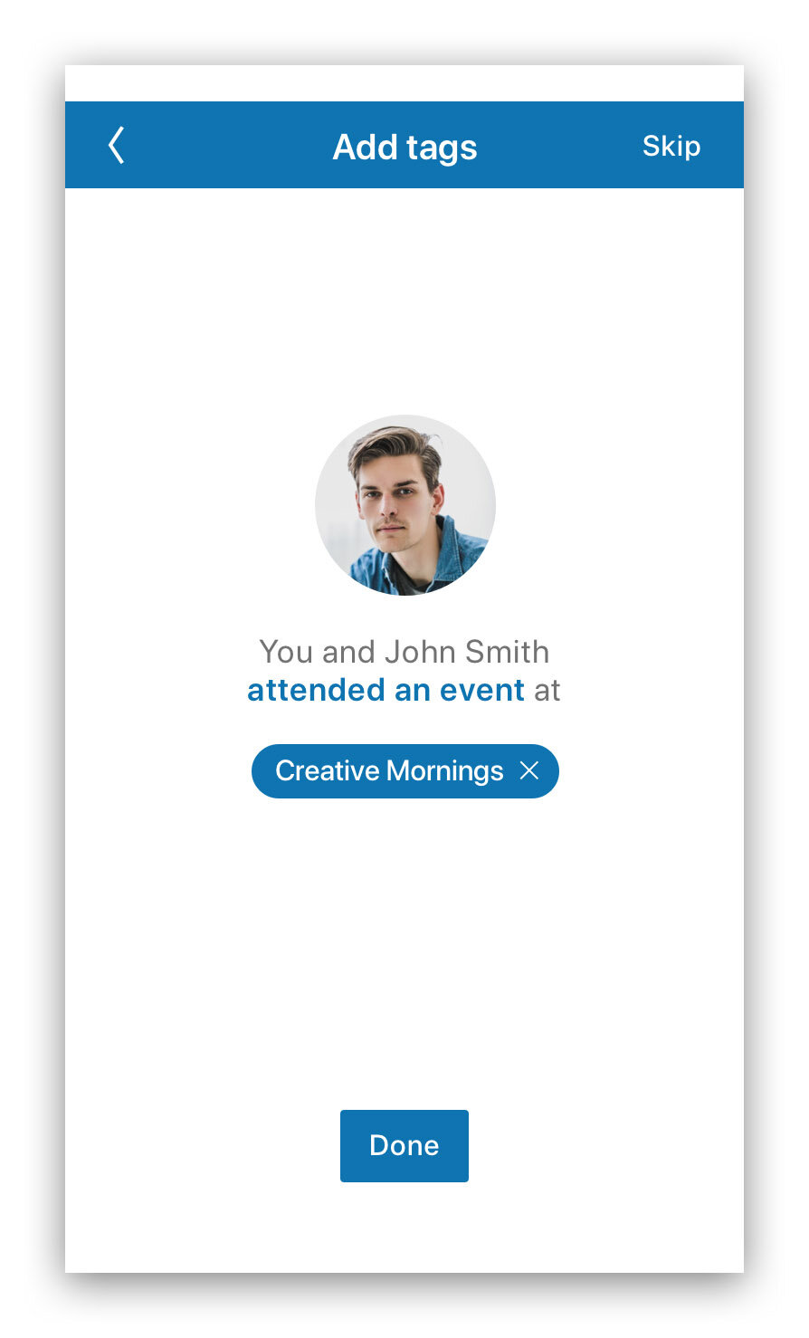
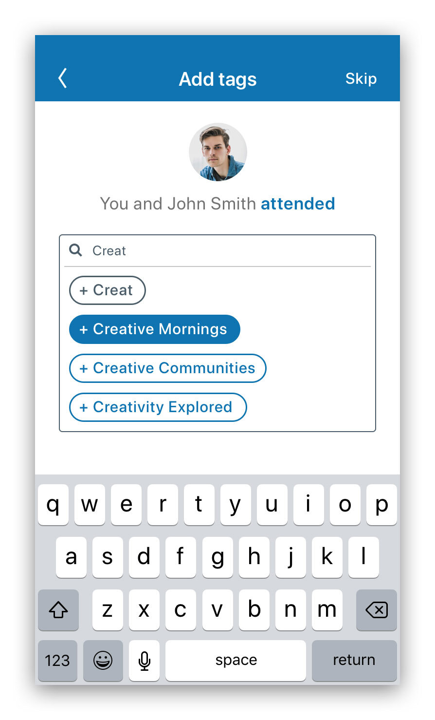
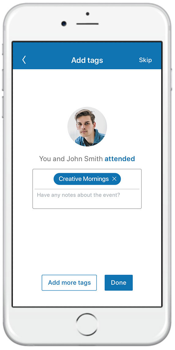
ITERATIONS / ADD TAG
The primary source of confusion involved adding a tag at the time of connection, which was unsurprising given that it was a completely new and unfamiliar feature. We cleaned up the copy and changed the flow to better inform users of the value of tagging their connections.

Paper prototype

Initial digital prototypes


Final digital prototypes

ITERATIONS / CONTACT CARD
The other source of confusion was the “contact card” functionality, which featured highlights about the relationship; some users were confused about its role and the fact that it was separate from the profile page. We decided to integrate it directly into the profile as an expandable section to make its function more intuitive.

Should we make an independent contact card?

…or just keep highlights on the profile?

Relationship highlights - collapsed

Relationship highlights - expanded
ITERATIONS / MANAGE MY NETWORK
Users also expressed distaste for having to tap “My Network”>“Manage My Network” to access key connection management functionality, so we removed the “Manage My Network” screen entirely and nested all functions (Connections, Tags, Groups, Pages, etc.) directly within the “My Network” tab.

Two screens were required before to access connection management features
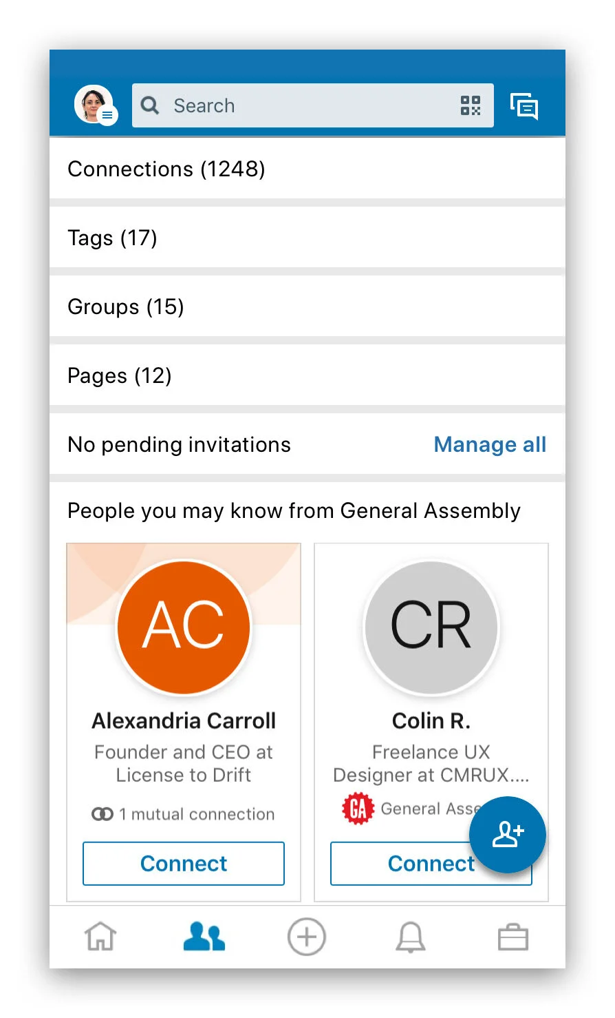
We brought functionality up a level onto a single screen
THE FINAL PROTOTYPE
We created an improved LinkedIn experience that encourages the user to tag their connections, while also providing useful default tags for those who don’t want to spend time organizing.
The interface is similar enough to feel familiar, while addressing key organizational and contextual shortcomings of the current app.
TAKEAWAYS
Group projects are wonderful. As someone who is used to doing solo work, I cannot stress enough how much I loved brainstorming and iterating on each other’s ideas. I felt we created much better solutions when we leveraged our diverse backgrounds and mental frameworks. I also liked the group accountability, and the ability to “multi-thread” our research and design processes.
Test early! I was grateful to have conducted paper usability tests, as we caught a variety of issues before we’d taken the time to bake them into the digital prototype.
Set time limits on certain activities. As much as I loved our group discussions, at times we allowed them to go on unchecked (e.g. affinity mapping and sketch synthesis). Some of our time would have been better spent on things like usability testing and iterations.
FURTHER EXPLORATION
Nested tag functionality — what if a user wants to get even more specific and create sub-tags (e.g. a cohort at General Assembly)?
Shared tags — can we share tags publicly as a way of encouraging organization platform-wide?
News feed customization — can we leverage tags to tailor what a user sees in their news feed and cut down on unwanted platform “noise”?