
GROUP PROJECT
CITY of BOSTON - BOSTON.GOV BACKEND REDESIGN
“How do we design a more intuitive, efficient, and helpful content creation experience for busy city employees who contribute to Boston.gov?”
The City of Boston’s Department of Innovation and Technology (DoIT) manages and supports the backend workbench for Boston.gov, which runs on the Drupal content management system. Over 200 city employees in every department use the workbench to publish content to the city’s public website.
Our group was tasked with making the work of content creators easier and more efficient by identifying and addressing issues with the workbench. Through a combination of interviews and contextual inquiries, we identified pain points and user desires and created a clickable prototype to test how certain targeted improvements could have a positive impact on every user’s workflow.
PROJECT INFO
3 WEEKS - NOV/DEC 2019
3-PERSON GROUP
GOAL: IMPROVE THE BOSTON.GOV CONTENT MANAGEMENT BACKEND (THE “WORKBENCH”)
SKILLS
WORKING WITH A CLIENT
PROJECT MANAGEMENT
USER INTERVIEWS + CONTEXTUAL INQUIRIES
DIGITAL PROTOTYPING (HI-FI)
USABILITY TESTING
TOOLS
TRELLO
SLACK
GOOGLE DOCS
OTTER.AI
SKETCH / SKETCH CLOUD
INVISION
MEET THE TEAM
ME

DESIGN LEAD
USER INTERVIEWS + CONTEXTUAL INQUIRIES
HI-FI DIGITAL DESIGNS
CLICKABLE PROTOTYPE
USABILITY TESTS
PREPARATION OF DESIGN DELIVERABLES

CLIENT LIAISON + ACCESSIBILITY LEAD
USER INTERVIEWS + CONTEXTUAL INQUIRIES
DRUPAL / WORKBENCH RESEARCH
ACCESSIBILITY RECOMMENDATIONS
HI-FI DIGITAL DESIGNS
USABILITY TESTS

RESEARCH STRATEGY LEAD
PROJECT MANAGEMENT
USER INTERVIEWS + CONTEXTUAL INQUIRIES
TASK ANALYSES
USABILITY TESTS
RESEARCH REPORT + PRESENTATION SLIDES
Communication among team members was key during this project—we made sure to meet at least once a day. There was a tremendous amount to do within a short time, so we multithreaded the process when possible by delegating tasks based on our strengths.
Morgan, with whom I’d collaborated previously, led the research process and served as project manager, while Julia served as client liaison, focused on accessibility requirements and on understanding the Drupal platform. Meanwhile, I tackled much of the design work and the final clickable prototype. We were all involved in major project decisions, as well as interviews, contextual inquiries, research synthesis, and usability testing.
HOW ARE USERS CURRENTLY USING THE WORKBENCH?
We understood from the beginning that this would be a research-heavy project: The client knew the workbench could be improved, but it was up to us to uncover specific pain points. As such, we wanted to be sure we both interviewed users and observed them as they worked.
FOCUS GROUP
Because the scope of the project was initially unclear, and because we were so unfamiliar with Drupal and the workbench, we chose to conduct a short focus group with several city employees to understand in a broad sense how they felt about the workbench.
We asked them to list:
How they felt about their current workbench experience
What they wanted to stay the same
What their pain points were
What they wanted to change or have implemented
The type of experience they hoped to provide for public visitors to Boston.gov
This helped us gain an initial understanding of where we should focus our attention during interviews, and what we should be keeping an eye out for during contextual inquiries.

Several city employees participating in our focus group.
USER INTERVIEWS + AFFINITY MAPS
We interviewed 13 city employees of varying technical competencies from a variety of departments, yielding 327 distinct comments that we each used to create our own affinity maps on Miro. From there, we collectively affinity-mapped our respective affinity map groupings and distilled our findings into seven possible top-line areas of focus (see below).
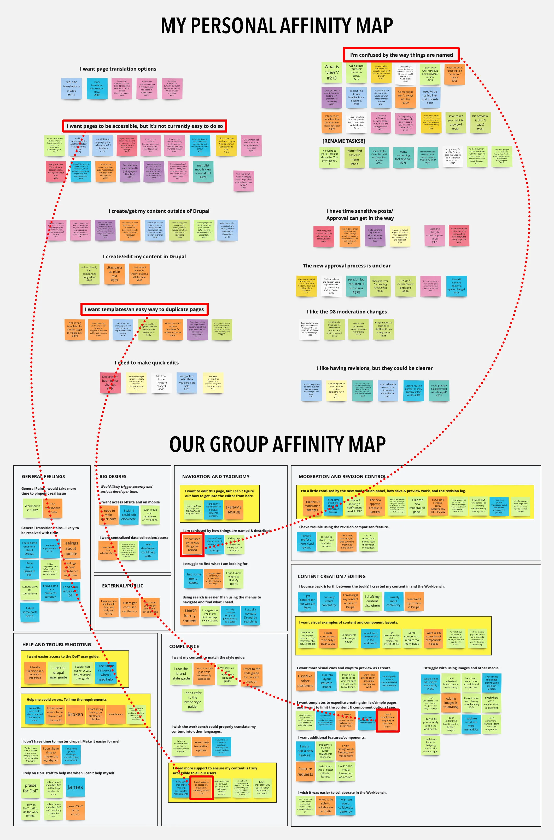
We synthesized our individual affinity map groupings (upper red boxes) in a collective affinity map (lower red boxes) to see how closely our research synthesis aligned. The yellow boxes represent our priorities/areas of focus for the prototype based on the result of the group affinity mapping exercise.
CONTEXTUAL INQUIRIES
In addition to interviews, we were able to perform contextual inquiries on most of our research subjects. They proved to be a particularly powerful tool for this project for several reasons:
Having never worked in Drupal ourselves, we wanted to see firsthand how users navigated its interface and used its tools
More importantly, we wanted to see what users were struggling to do, even if they weren’t expressing their frustration verbally

Performing a contextual inquiry
COMPETITIVE ANALYSIS
Many users did not trust the workbench’s preview mode, so we analyzed two popular website-creation tools, Wix and Wordpress, and found that their preview modes were better integrated. Their content moderation and publishing processes were more straightforward as well.
We also noticed that City of Boston employees rely heavily on Google Docs as part of their content creation process, so we hoped to make the workbench experience as similar as possible by incorporating features that users took for granted, such as auto-save.
SYNTHESIZING THE PROBLEM
WORKBENCH (USER) PROBLEM STATEMENT
“City of Boston employees producing and editing content for Boston.gov are struggling to use the Drupal workbench and often have to rely directly on DoIT staff because the workbench is inefficient and unintuitive.”
DoIT (BUSINESS) PROBLEM STATEMENT
“DoIT needs to improve the Drupal workbench experience for content producers and editors so that these users can easily and independently produce content for Boston.gov. These changes will improve the quality of their work experiences and the content they create, as well as free up resources at DoIT for strategic innovation.”
IDEATION AND DESIGN
Given the tight three-week timeline of the project, we chose to solve these problems with a three-pronged approach. We settled on the following fixes because they were most frustrating to the greatest number of users, yet seemed like they could be addressed with relatively simple designs. Our complete research findings and improvement proposals, including those we chose not to prototype, were delivered to the client in a final report.
ISSUE #1: NAVIGATION AND TAXONOMY
SOLUTION: REORGANIZE MAIN NAVIGATION AND RENAME KEY MENU ITEMS
“We believe that by making page-editing actions more visible and intuitive, all users will have an easier time performing core functions of their workflow.”
WHY DID WE FOCUS ON THIS ISSUE?
All user types were negatively impacted
Taxonomy broke natural language conventions (“tasks” to edit page instead of “edit”)
We observed users struggling to navigate to key functions within the workbench
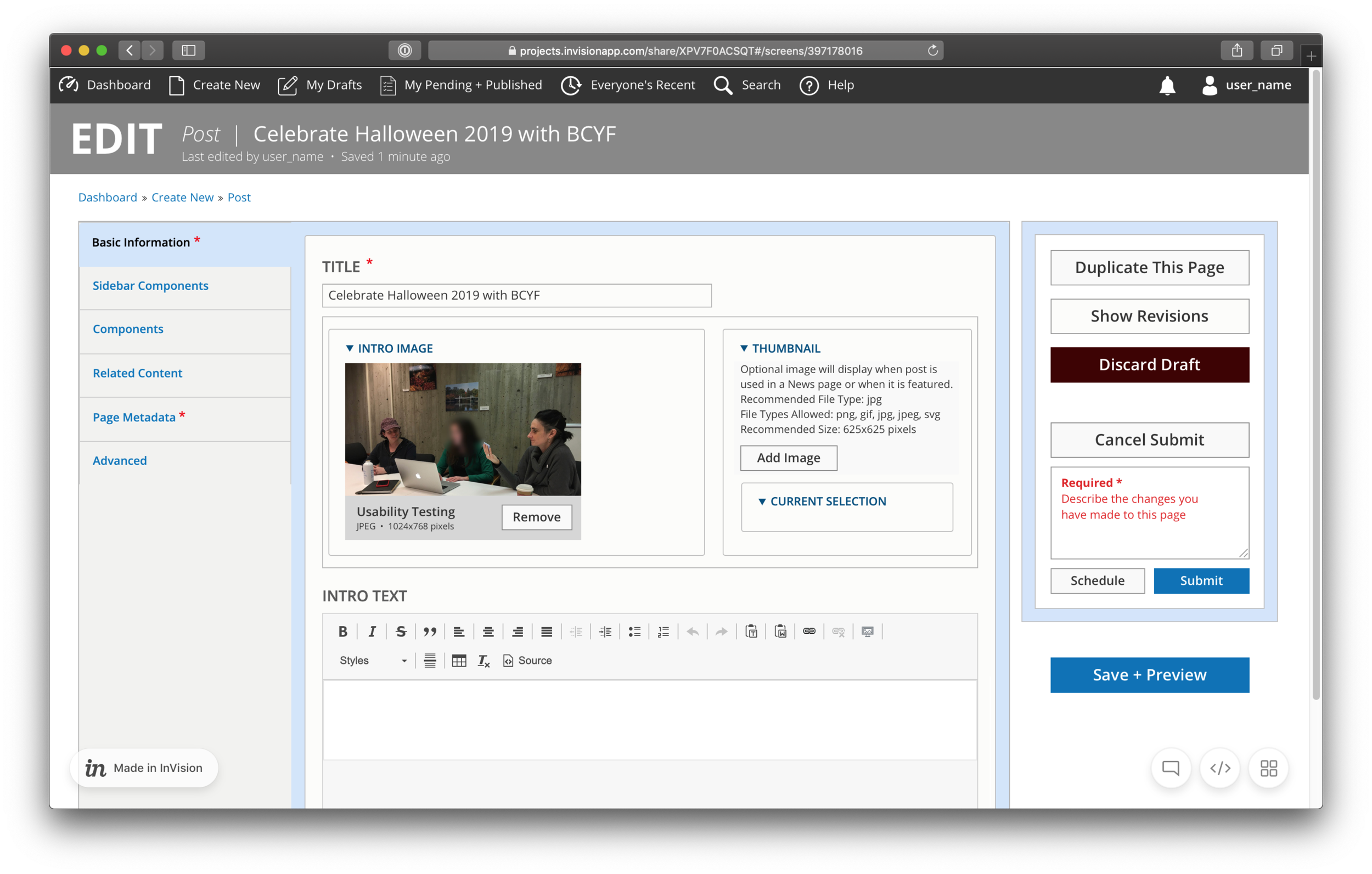
SOLUTION #1A: WE MADE PAGE STATES OBVIOUS, AND TAILORED ACTIONS ACCORDINGLY
I created a fixed, informative status bar at the top of the page, with quick-action buttons tailored to the current page state. I also clarified the language in the Revision Log prompt that appeared during the submission process.

The current draft preview mode lacked quick, intuitive actions, and the status message in the center only showed up during preview mode.

My redesign made content states obvious (left), provided helpful information (center), and tailored available actions to page state (right).

Relevant page actions were easily accessible by clicking “edit,” and we introduced helpful options like being able to cancel submission and re-edit a page after it had been submitted for review.

I designed the status bar to persist across all page states.
SOLUTION #1B: WE CLARIFIED TAXONOMY BY USING COMMON TERMS WHEN POSSIBLE
We also noticed that users were confused about much of the taxonomy throughout the workbench; the biggest pain point was the newly-introduced “tasks” button that revealed page actions but that most users struggled to find. We brought back “edit” (see images above) and clarified other key terms to make the purpose of actions clearer.

Existing terminology and options were very confusing to users. Terms like “node” made sense to developers, but users often had no idea of what they meant.

An example of confusing page actions.

We clarified the taxonomy to make actions easier to understand. For instance, we combined Save and Preview buttons, as there seemed to be no reason not to save work before previewing it.
SOLUTION #1C: WE CREATED A NEW WORKBENCH DASHBOARD WITH USEFUL QUICK ACTIONS
Most users did not find the current workbench “homepage” to be useful, so I created a new dashboard with quick actions to replace it:
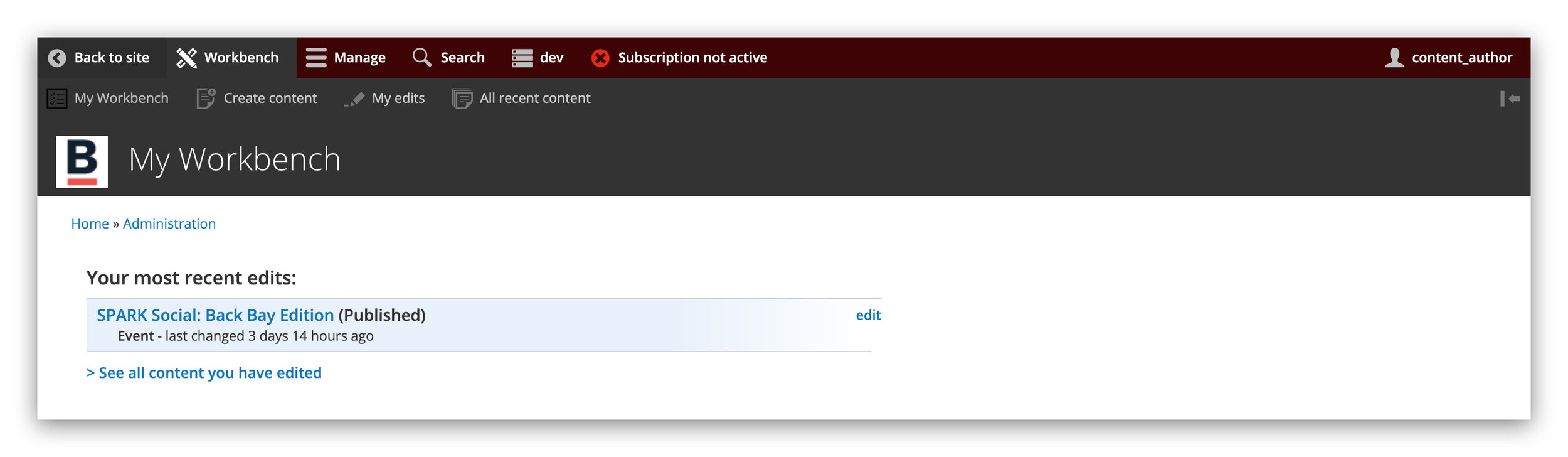
The exiting “homepage” was of limited utility to users.

My initial dashboard prototype was well-intentioned, but proved to be a bit too simple for users.

The final prototype included customizable view options, as well as a redesigned top nav bar.
ISSUE #2: EXAMPLES AND EXPLANATIONS
SOLUTION: REVISE PAGE TYPE DESCRIPTIONS AND PROVIDE ACCESS TO EXAMPLES
“We believe that by incorporating examples and illustrative descriptions of content and component types in the workbench, we will help content producers make better, faster selections and feel more mastery of the workbench.”
WHY DID WE FOCUS ON THIS ISSUE?
All user types were confused by page layout and component choices
Many users had to reference the admin guide while working in order to understand page types
By improving the descriptive copy and adding examples, we hoped to model what could be done for the similarly confusing “components” selection process
SOLUTION #2A: WE REWROTE THE DESCRIPTIVE COPY TO MAKE THE PURPOSE OF EACH PAGE TYPE CLEAR AT A GLANCE
When creating a new page, users had trouble distinguishing between the litany of available page types (many of them not relevant to their department), and frequently had to find and reference the workbench admin guide in a separate browser tab. To address this, Julia rewrote the descriptive copy using natural, understandable language that clarified their purpose of each page type.

Users did not find the existing page type descriptions to be helpful in making a selection.

Julia included clearer copy to help content creators make faster, more informed choices.
SOLUTION #2B: WE CREATED AN EXPANDABLE PAGE TYPE VIEW WITH VISUAL EXAMPLES AND ADDITIONAL DETAILS
Many users expressed a desire to see examples of each page type, so Julia created an expandable view that provided both a screenshot of an existing page and a component-level wireframe to show how it was built, along with additional details. Though we did not have time to prototype it, we hoped that a similar redesign could be applied to the “components” selection process, as users had expressed a similar lack of clarity about which components to choose when building out their pages.

Julia’s redesign featured an expandable view with additional details and a visual example.

In response to user feedback, we added larger visual examples in the final prototype.
ISSUE #3: ERROR-AVOIDANCE AND ACCESSIBILITY
SOLUTION: CONSISTENTLY SUPPORT ERROR AVOIDANCE AND ACCESSIBILITY GOALS
“We believe that by addressing at least a few of these issues for all users, we will achieve more streamlined workflows and reduce reliance on DoIT staff and the admin guide.”
WHY DID WE FOCUS ON THIS ISSUE?
All user types expressed frustration when field and component requirements were not communicated upfront
Uncommunicated requirements trapped users in repetitious loops, slowed them down, and made them feel like they were doing something wrong
Small adjustments to micro-copy or UI design could improve commonly used functions like image upload and content submission
SOLUTION #3A: WE MADE REQUIRED FIELDS OBVIOUS AND EXPLAINED THEIR PURPOSE
We saw that users were frustrated when they stumbled over uncommunicated field requirements or component restrictions: Character limits only showed up after submission, and fields like image “alt text” were not explained, so users skipped filling them out, stymying public accessibility compliance. We redesigned the image upload interface to highlight accessibility goals and streamline the process, and made character limits and other component restrictions obvious.

The current image upload process was rife with confusion and unclear restrictions. In addition, fields like alternative text were not required, stymying accessibility compliance.

Our redesigned uploader was both visually pleasing and clear about required fields. It made alternative text required and explained to users why this was important.
SOLUTION #3B: WE MADE THE WORKBENCH COLOR PALATE ACCESSIBILITY COMPLIANT
Julia discovered that many of the colors being used in the backend interface did not meet basic accessibility standards, so she found several new swatches with better contrast ratios for us to use in our prototype.

Both the existing workbench and our initial prototype featured colors that failed basic accessibility standards.

Julia found accessibility compliant color swatches for us to use in our final prototype.
SOLUTION #3C: WE DIRECTLY EMBEDDED LINKS TO SUPPORT RESOURCES
We strove to make the admin guide as unnecessary as possible, but knew that there might still be instances in which users would want to reference it. As such, I redesigned the top nav bar and made the “help” button link directly to the guide so that content creators could access it quickly and avoid digging through their email for the link. Given more time, we would have liked to embed additional help links throughout the workbench that would bring users to specific sections of the admin guide.

I made the help button in the global nav bar link directly to the admin guide, so that users could reference it quickly if necessary.
TESTING OUR DESIGNS
We conducted four usability tests with our initial digital prototype, asking users to:
Give their opinion on the new dashboard and its taxonomy
Navigate to the page selection screen and use the examples to make a decision about what page type to use
Draft a post and preview it
Return to the editor and make further changes
Submit the post for approval
Give their opinion on the new “cancel submission + edit” feature.
WHAT WE HEARD
POSITIVE FEEDBACK
This is easier to navigate than what I am used to.
I find the page type examples to be helpful.
Moderation seems simpler and easier to get through.
CONFLICTING FEEDBACK
I like this dashboard vs. I want more/different information in this dashboard.
I want the page edit options in a center pop-up vs. I want the page edit options in a sidebar.
“CLOSE, BUT NOT QUITE” FEEDBACK
I want to see larger examples of published pages in addition to the component-level mockup.
WHAT WE OBSERVED
Users very quickly and easily navigating to where they needed to go.
Users being excited — “ooo”, “ahs”, and body language that suggested sudden active excitement about something, such as leaning into the screen or sitting up attentively.
WHAT WE CHANGED IN RESPONSE
We added a list view to the dashboard for users who did not like the large icon view
We made the page edit actions pop-up more obvious
We tweaked the taxonomy of several actions (from “Copy this page” to “Duplicate this page”)
We added larger visual examples of each page type

Performing a usability test.
THE FINAL PROTOTYPE

By making navigation and moderation states bold and obvious, using common words and terms, embedding examples, and being clear about required fields, we were able to greatly improve the Boston.gov workbench experience. Key actions took less time, the options available to users were more relevant to what they were doing in the moment, and the progression from draft to preview to submission to published content was more intuitive.
Every employee who tried the prototype commented on how much simpler and more straightforward it was to use.
TAKEAWAYS
Bring developers into the design process early! Our client wanted us to operate on the assumption that anything we proposed could be implemented, but upon presenting our final prototype to their development team, we received a fair amount of commentary that likely would have been helpful to take into account early on.
Backend/internal-facing design is extremely important! Most of General Assembly’s prior projects for the City of Boston have been public-facing, but city employees were incredibly excited that one of their most frequently used internal tools was getting attention. We also saw firsthand how a frustrating platform experience can hamper productivity and burden support staff.
Usability testing is crucial, but also a lot of fun! In this project more than any other, I understood the critical value of testing—perhaps it was the reality that users might actually use what we designed, so we strove to get it right. I loved being able to watch users and pepper them with questions as they clicked through the prototype, and their feedback led us to create much more refined deliverables for the client.
ADDITIONAL RECOMMENDATIONS
Bring visual examples and descriptive copy to the “components” selection menu.
Allow dashboard customization to increase flexibility and efficiency.
Collaborate with departments that publish content frequently to develop templates for common posts.
Implement auto-save to prevent loss of work.
Further embed help tips and access to user guide throughout the Editor.
Provide users with access to the Boston.gov Brand Guidelines from within the editor.
Embed either Grammarly or Hemingway in text editor fields to encourage more accessible writing that matches Boston.gov’s optimistic and informative tone.
Provide content creators with translation capability.
Implement accessible design recommendations within both front- and back-end.