
SOLO PROJECT
UPSTAIRS DOWNSTAIRS ANTIQUES: E-COMMERCE CONCEPT
“How do I bring spontaneity and surprise to an online shopping experience?”

Upstairs Downstairs Antiques is a charming shop in the Beacon Hill neighborhood of Boston. I selected it as my “client” for this two-week class project as it lacked e-commerce functionality and its eclectic inventory was perfect source material for card sorting exercises. Over the course of the project, I learned about how shoppers categorize antiques and developed a clickable prototype of an online store that reflected their mental models, all while making the online shopping process fun and interesting.
SKILLS
INFORMATION ARCHITECTURE / CARD SORTING
WIREFRAMING
DIGITAL PROTOTYPING (LOW / MID-FI)
TOOLS
GOOGLE DOCS / SUITE
OTTER.AI
OPTIMALSORT (FOR REMOTE CARD SORTS)
WHIMSICAL
AXURE
PROJECT INFO
2 WEEKS (OCTOBER 2019)
SOLO CLASS PROJECT
DEVELOP E-COMMERCE PROTOTYPE
RESEARCH / UNDERSTANDING THE COMPANY
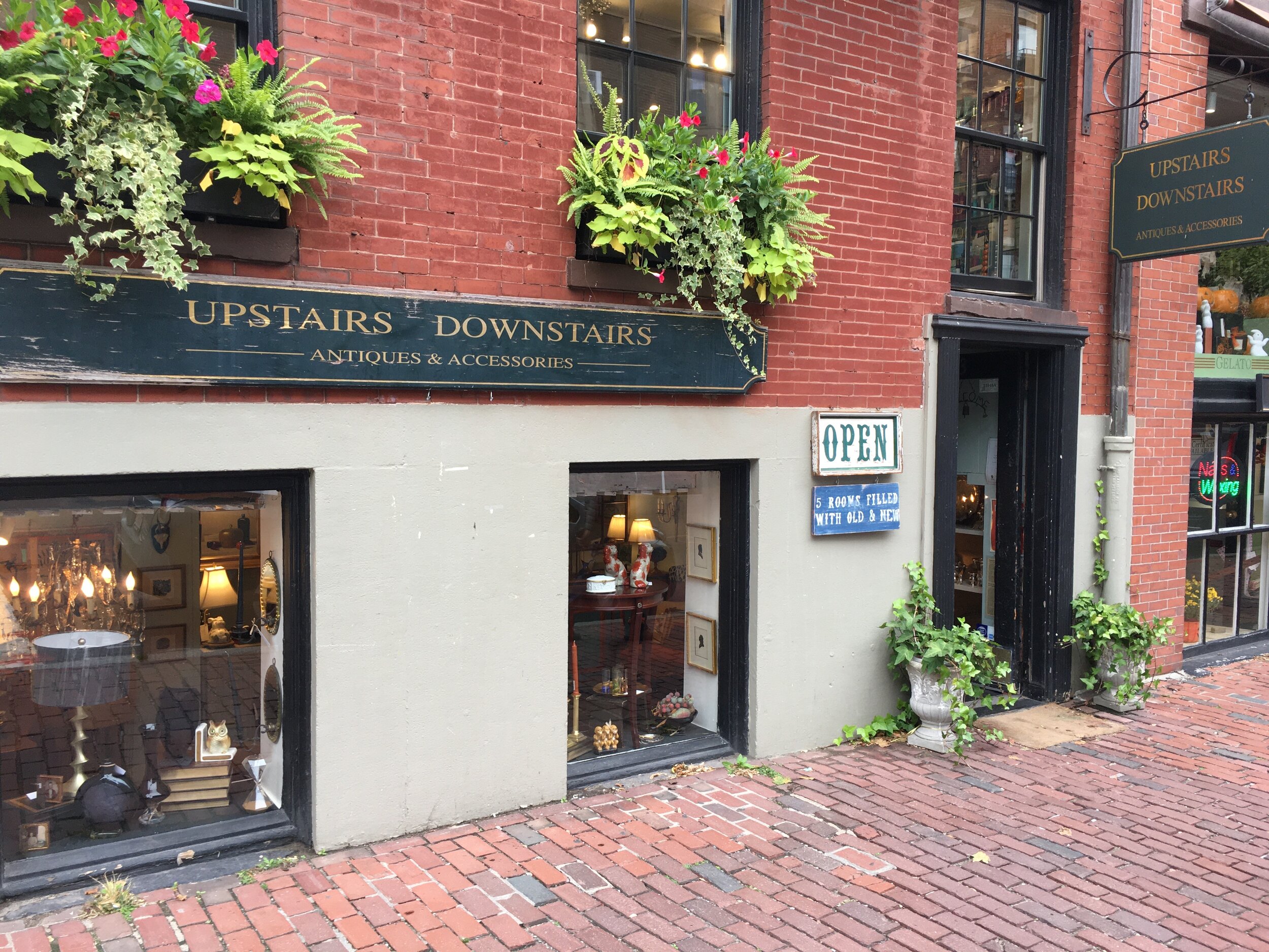
I started by visiting the store to get a feel for the physical shopping experience.
What struck me was the way in which products were showcased in various rooms, and how the shoppers explored these displays as they browsed the store. The overall vibe was homey, which later influenced my design aesthetic.
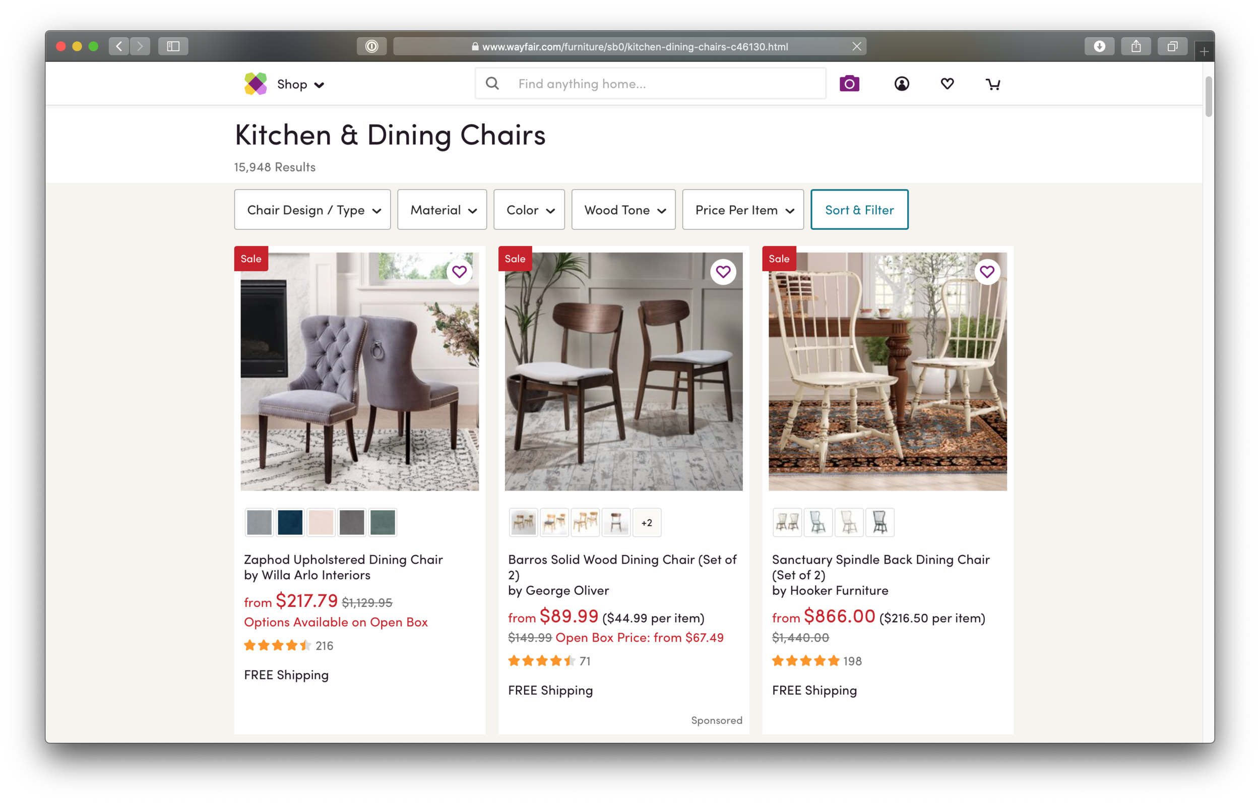
RESEARCH / UNDERSTANDING THE COMPETITION
I compared the websites of a direct local competitor (Danish Country & Modern) with those of two e-commerce giants (Etsy and Wayfair) to see what worked well for them.
All three followed basic e-commerce conventions, but where the local shop’s site was bare-bones in terms of functionality, Etsy and Wayfair provided better searching, browsing, and related-item discovery. They also scored higher on NNG’s 10 UI usability heuristics, which highlighted the value of features like subtle visual feedback when adding items to the cart.


RESEARCH / UNDERSTANDING THE USER
Having a Carrie Mathison moment on my kitchen wall…
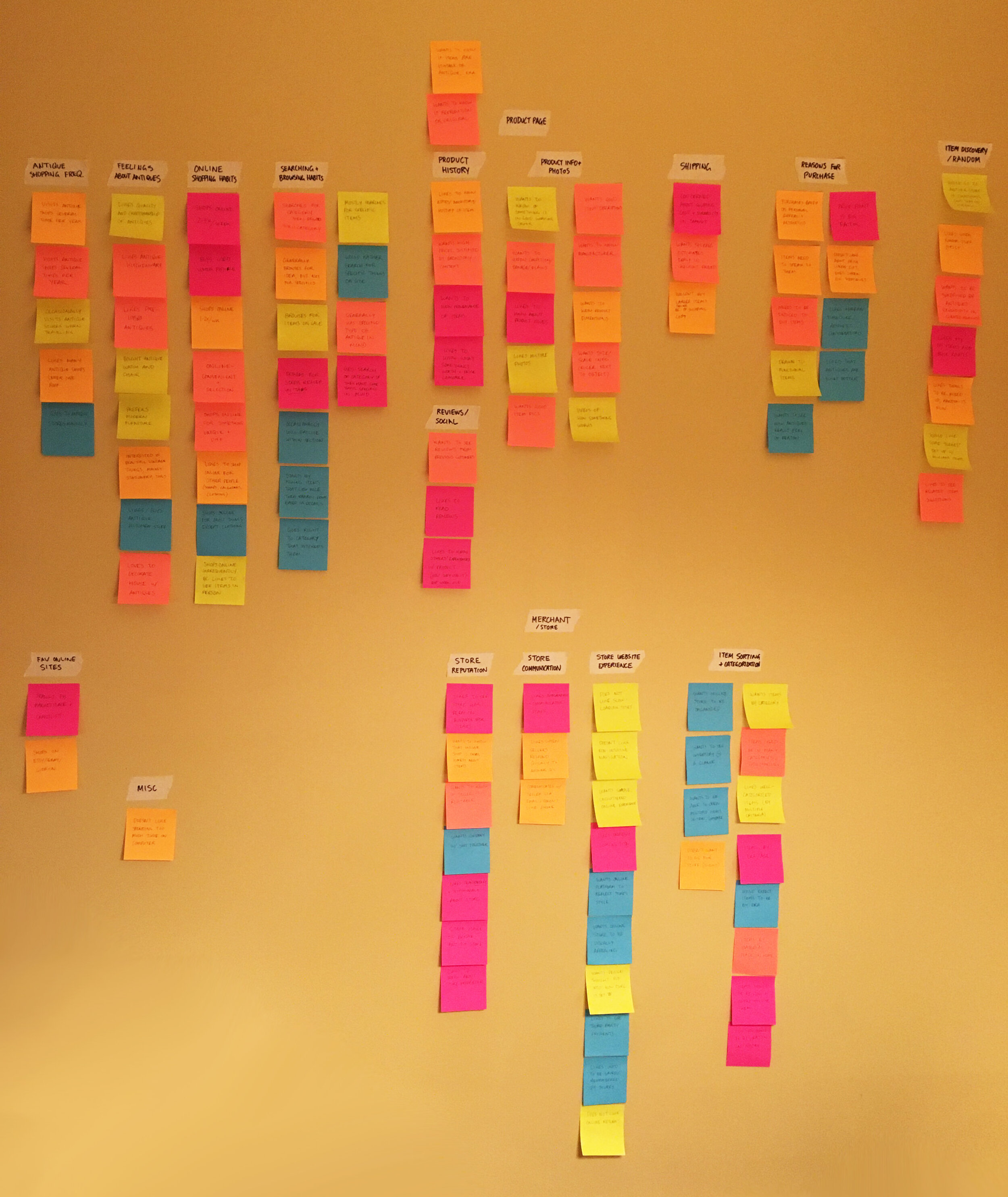
Next, I interviewed five antique shoppers to better understand their goals and motivations. All had visited antique stores at least several times, and shopped online at least several times per year. Post-interview, I created an affinity map to synthesize my findings.
What stood out was the importance of the element of surprise — shoppers didn’t always go into a store with a specific item in mind, but enjoyed discovering organically.
Shoppers also:
Were hesitant to trust an unknown online store
Wanted to know more about an antique’s origins and history
Wanted clarity about shipping costs as early in the process as possible
Preferred clean, well-organized websites
RESEARCH / EVERYTHING IN ITS PLACE
OPEN CARD SORTS
Shoppers might like spontaneity, but they also often want something specific, so intuitive, browsable categories are key.
To understand where shoppers might expect to find items on the site, I asked interviewees to perform an open card sort with 100 photos of items.
Categories like artwork, chairs, silverware, and lighting fixtures had the highest level of agreement
Multi-category items like kitchenware, dishware, glassware, and accent pieces were more divisive

CLOSED CARD SORTS
To help sort out these disagreements, I asked two additional participants to conduct a closed card sort:


SITE MAP
Their responses helped me settle on category names, which informed the site map:

SYNTHESIS / CRYSTALLIZING THE PROBLEM
“Antique lovers need a straightforward and trustworthy online shopping experience that mimics the novelty of in-store browsing so they can more easily find and purchase exciting new antiques.”
“I believe that by creating an e-commerce solution that encourages both tailored browsing and serendipitous discovery, provides relevant product information, and allows a clear channel of communication with the shop owner, I will make the online shopping experience just as exciting, surprising, and reassuring as that found in store.”
“I will know this to be true when shoppers report feeling confidence, trust, and enjoyment when browsing the online store.”
DESIGN / USER FLOWS
Using the problem and solution statements above, I created three user flows to help guide my design process: one for browsing the store’s inventory and buying an item, one for checking out, and one for sharing an item.


DESIGN / HOMEPAGE
I knew that my store’s homepage had to be captivating, as it would be seen first. Why not mirror the in-store experience by showing off one of the “curated” rooms to pique curiosity and encourage item discovery?
I also wanted to address shoppers’ concerns about trust and communication by highlighting testimonials and business information on the homepage. A secondary concern was placing contact info prominently in the global header.
My more traditional homepage concept
My idea for the “browsable rooms”
The final product combined both concepts
DESIGN / BROWSE PAGE
Intuitive sorting was essential for shoppers who wanted to browse through item categories to find the perfect piece. I followed convention by placing relevant filter categories on the left, and created shortcuts on the item previews to allow favoriting and adding to cart.
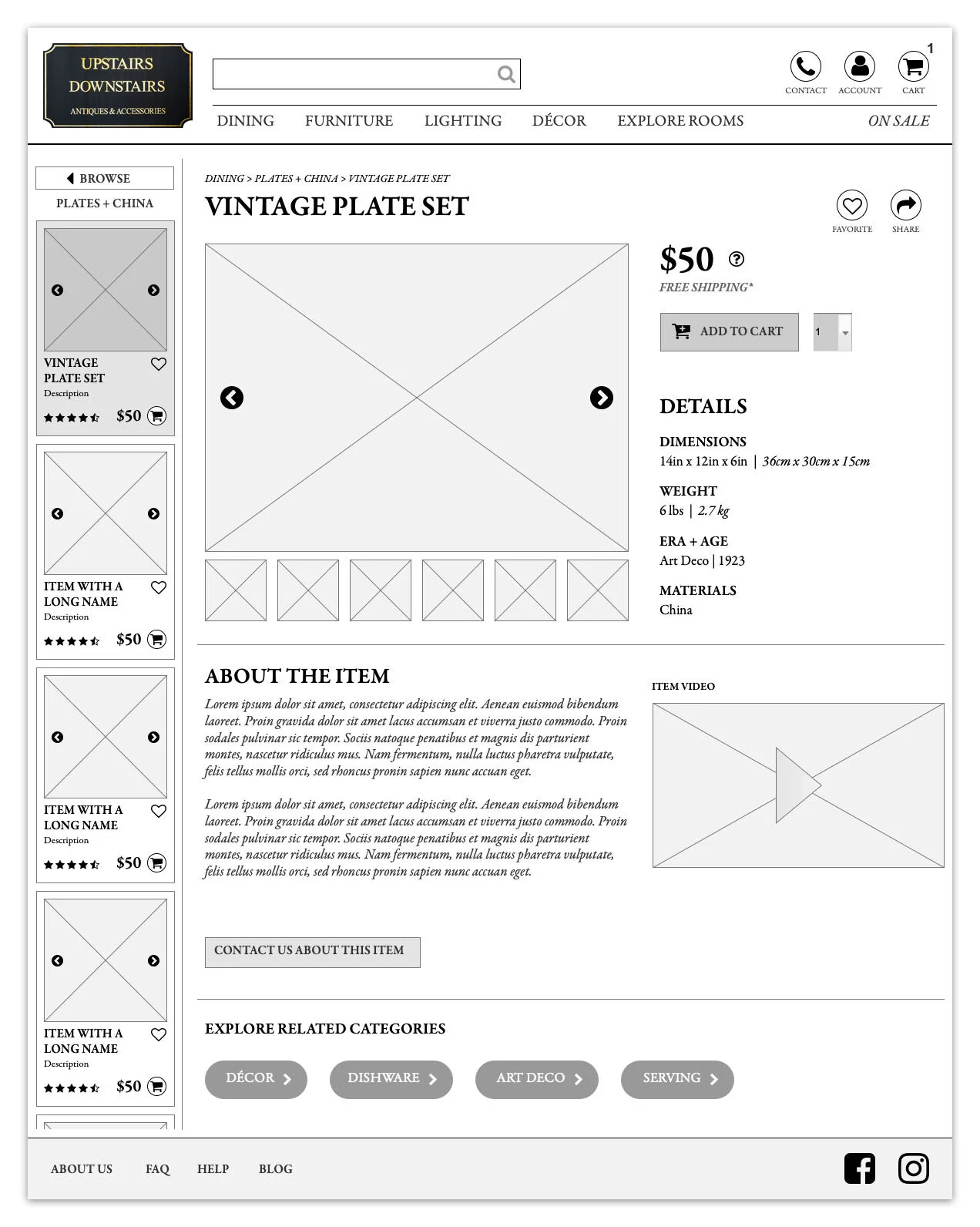
DESIGN / PRODUCT PAGE
Shoppers were looking for a variety of information about the items, including shipping, dimensions, age/era, and materials, as well as detailed information and videos about the item’s history.
I decided to include a browse ribbon on the left, which enabled shoppers to quickly compare items from the browse page without completely losing their place or having to open multiple tabs.
Later iterations included the “browse ribbon”

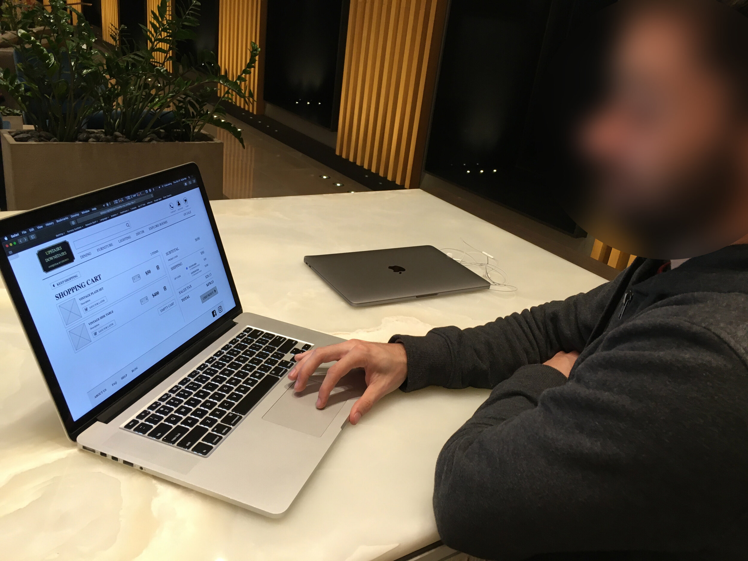
DESIGN / SHOPPING CART
I kept things clean and simple, but made sure to incorporate an accurate shipping quote before the checkout process to address the concerns that some interviewees had voiced.
DESIGN / CHECKOUT
Most computer screens have wide aspect ratios, and yet many checkout experiences seem to flow vertically, which can be disorienting. Why not better make use of the landscape viewport by guiding the shopper horizontally through the checkout process?
ITERATIONS / USABILITY TESTING
How easily were shoppers able to find, purchase, and share items? I asked them to complete two tasks to assess site usability:
“You're looking for a set of dishes for a friend. You browse to find some and read relevant information before deciding to purchase them. You do not have an account with the store, nor are you interested in setting one up at this time.”
“Upon finding those same dishes and reading about them, you decide to email your friend information about them.”
All users were able to complete the tasks, but there were hiccups along the way…
ITERATIONS / BROWSE SET VS. BROWSE RIBBON

Old, confusing layout (left) vs. new, cleaner layout (above)
I wanted to encourage related item discovery, but users were confused about the difference between the vertical browse ribbon and the horizontal “Browse Set” section on the item page. I removed the latter, figuring that the browse ribbon would accomplish largely the same goal.
ITERATIONS / ORDER CONFIRMATION PAGE
Initially, there was confusion about what the edit button actually edited, so I added edit icons to each section of the confirmation page. However, this further confused some users, who didn’t realize what the icon meant, so I replaced the icons with clear words. I could likely make it even clearer in future iterations by making the “edit” text more prominent.

Not clear what “edit” actually edits

Edit icons were unclear to some users

Text provided a simple alternative
ITERATIONS / THE ROLE OF REVIEWS
I included item reviews without thinking about their usefulness in a one-of-a-kind store. Upon this being pointed out by users, I removed reviews from the item pages. I also decided to put business reviews on the homepage to build trust in the store among new customers.

I realized that reviews made no sense in the context of one-of-a-kind items

Business reviews seemed more fitting on the homepage
THE FINAL PROTOTYPE
A simple, intuitive, and trustworthy e-commerce experience that feels like you’re in the store, while offering all the convenience and flexibility of online shopping.

TAKEAWAYS
Don’t get mired in the details! As much as I loved diving into Axure to create all the delightful interactions in the prototype, it sometimes came at the expense of important things like...
Testing! I would have liked to set aside more time to do further usability tests and uncover remaining pain points.
Think before you follow trends! I incorporated e-commerce functionality without thinking about whether things like reviews really made sense for unique items in an antique shop.
FURTHER EXPLORATION
Account management
Save for later/favorite functionality
Refining the header/footer
Responsive mobile version